“Working with Scott was a pleasure. He took the time to learn our business and worked diligently to provide us with what we needed. Very professional and extremely responsive. Would highly recommend.”

I’ve studied and practiced Web Usability for almost 20 years. I obtained a firm understanding of this concept at the Thunder Lizard Web Design World Seattle Conference, which I attended two times in 2004 and 2008.
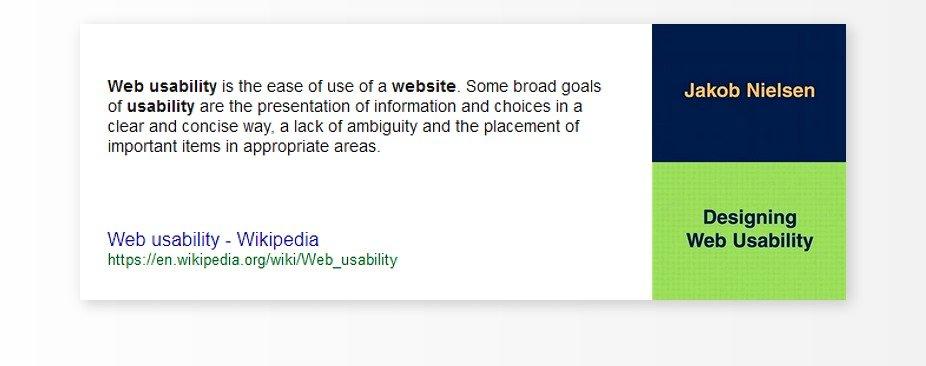
These conferences as well as the groundbreaking books “Designing Web Usability” by Jakob Nielson and “Web Redesign 2.0: Workflow that Works” by Kelly Goto shaped my design philosophy into what it is today.
Web Usability is simply the practice of creating websites and organizing information clearly—following standards of what should go where—to be easily and instantly recognizable by the end user. People that view your website allow themselves about 3-4 seconds to make sense of a website’s layout, looking for the logo, menu items, contact information, etc. to be found in a place that they are used to seeing. If they do not see these basic functions in a fairly common area they’re much more likely to simply close the website and move on to the next one—hoping that it will be more understandable and presented in a way that can be quickly and easily interpreted.
In other words—if your website doesn’t instantly make sense and follow some basic standards that 95% of other websites that they are used to seeing every day then they will quickly abandon it and look for one that does. It’s just like using any tool—a phone for example. If a new phone had the keypad arranged in a different order you’d find it incredibly difficult to make a phone call or do anything with it, and you’d probably return it for one with a keypad that you are familiar with.
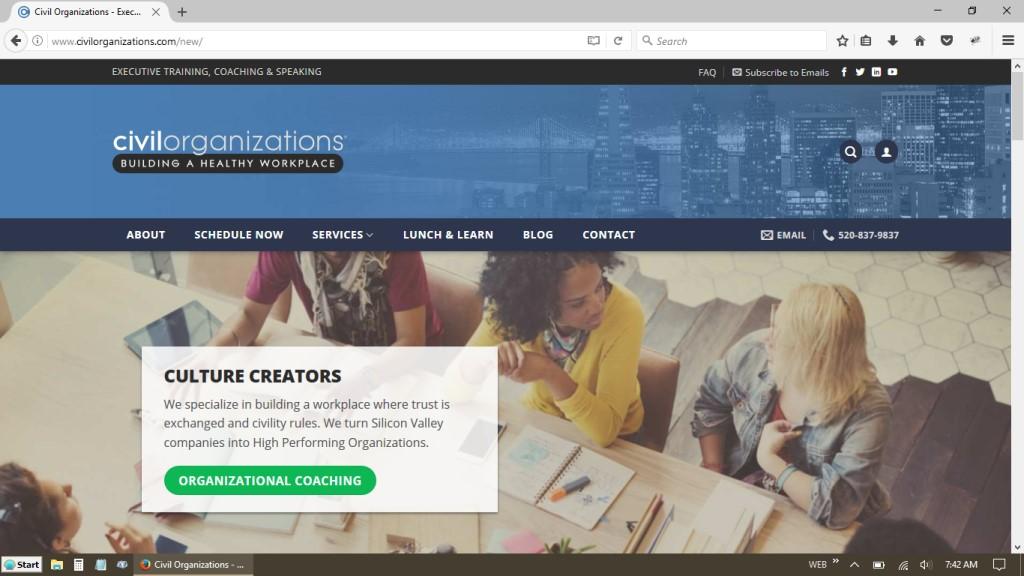
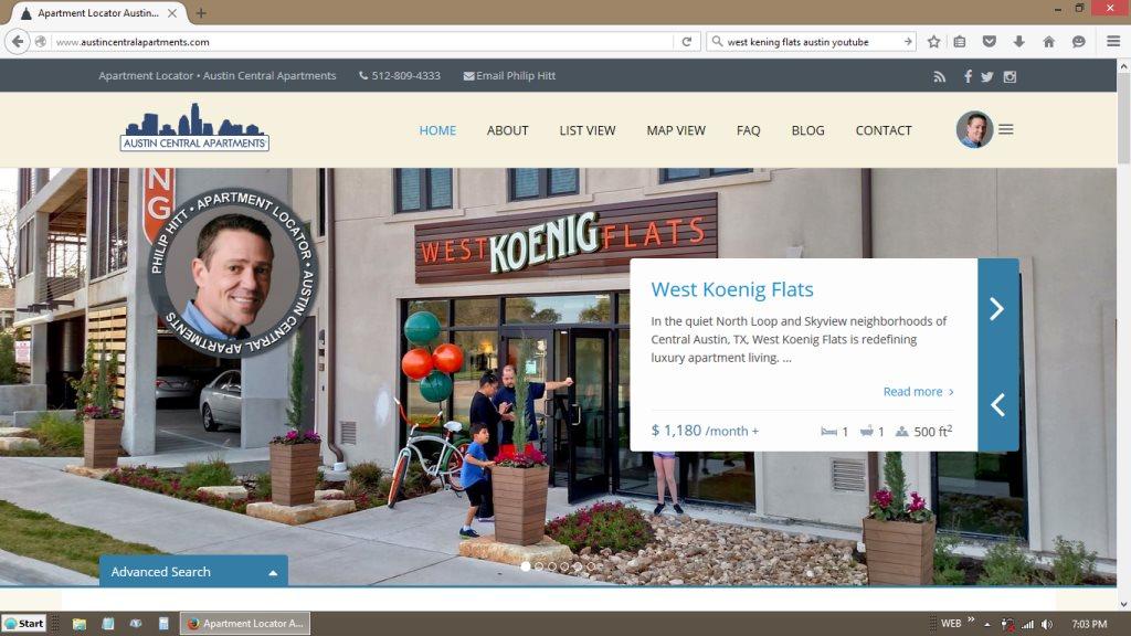
You can see in the image above that the logo, contact info, menu and social networks are in a standard, common position—allowing the user to instantly see and recognize what is what, and where to click quickly to take them to the information they are trying to find.
This is what most of my clients wish to accomplish with their business website. Any type of design and layout can be created, though you’re taking a risk with a more elaborate, unique site and often giving up some click-throughs and ease-of-use.
A website is a tool, and a user expects to use this tool quickly and efficiently. Any deviation from the standards of Web Usability is guaranteed to confuse the average user, cause frustration and make them look for a more understandable website in which to find the information they seek.
So even though a business website may look simple in design and layout—there are a dozen reasons for this and behind the scenes everything is working to provide comfort and ease-of-use to the end user. This design format also allows all aspects of the website and information architecture to easily flow and adapt to all devices such as TVs, tablets, laptops and mobile phones.
The end result is a useful business tool where one can instantly find your contact information, bio, the main page that they came there for in the first place or a map to quickly drive to your office.


