Skip to content

Client Testimonials


“Working with Scott was a pleasure. He took the time to learn our business and worked diligently to provide us with what we needed. Very professional and extremely responsive. Would highly recommend.”

Collin Wright

“Scott worked with me on the design of my website making adjustments to help me realize my vision. He was very responsive to feedback and I love the dynamic result. Thanks, Scott.”

Diane Whitney

“Scott was able to help transform CMT’s website, blending together the artistic vision of the organization and the most current web design. He helped create a new responsive experience for our users that drives ticket sales and donations, in a way that creatively tells CMT’s story and engages with our broad and diverse audience.”

Dana Zell

“Scott started on my brand new apartment locator website the day I gave him a down payment, and took all interior and exterior photography. Scott was efficient, kept me posted and went way overboard on all the design and function details. Rather than creating a boring apt. website Scott made a browsable real estate site with MLS photos, embedded videos, rent, sqft and maps so users can do real research on our site.”

“Working with Scott Lewis was the key step that allowed Didge Project to transition from an outdated website into an attractive WordPress build. Scott went out of his way to research and find the best theme. Scott helped me install all the plug-ins I wanted, and went over and above what I asked of him. I highly recommend working with Scott and hope to have him do more sites for me in the future.”

AJ Block - Musician

“Our Austin public relations firm found Scott on Google while looking for someone that we could form a long term working relationship with. Scott stopped what he was doing and helped us make some important changes to our website. He was extremely responsive and updated everything we had been avoiding for a year. Highly recommended.”

Lindsey Broussard - Leverage PR

“Scott turned our outdated text website into something our Club can really use. We can now showcase our scholarship winners, get RSVPs for events, sell tickets to events online and more. Scott’s always available to make additions or changes quickly. I just send him an email and he updates our website in a matter of hours, couple of days max.”

Highland Lakes Aggies Club - Mike Linam

“Scott took basically nothing but an idea from me and ran with it. He created a unique logo and a classy-looking website that I get compliments on all the time. He’s very easy to work with and can change anything I need immediately. Scott charges very little for website maintenance and often makes minor updates without me even knowing. Highly recommended!”

Jeff Linam Square One Home Inspections

“Port Aransas Realty recently hired Scott to enhance our SEO and fine-tune our agent blog. We’re now #1 in Google organic for our main keyphrase, ahead of Realtor.com, Zillow and Trulia. Scott met with us at our office with a list of ideas and stayed in constant contact through completion. Scott does exactly what he says he will do with a great attitude. We are very happy with the results.”

Keith Mcmullin Broker, Port Aransas Realty

“I’m not a very creative person. Scott took no creative input to create a beautiful website. Scott built the website quickly and when I need changes made he responds quickly. I’m complimented weekly about the professionalism of the site compared to my competitors. Scott has given me a distinct advantage over my competitors.”

Mark Serrioz Expert Home Inspections Dallas

Civil Organizations

Civil Organizations Website Redesign

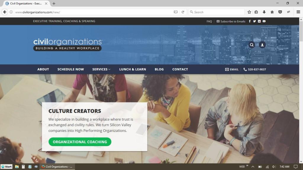
Eric Thompson is an executive coach and professional speaker based in San Jose, California. His entire Internet presence required a makeover and new modern website.

A new theme was chosen and customized to perfect its responsiveness, user login, text formatting and style. The contact and scheduling form was separated and made more modern and stable.

Personal photos were used in the Home Page slider to reflect Eric’s skill and passion for the industry. The logo was enhanced to look much better against a color background, with all set and sized to look great on mobile.

A static, default-styled form that integrated with MailChimp was recreated to match the style of the Home Page. Now visitors are more encouraged to sign up for the free guide and submit their contact information. Eric’s 16.5MB JPG brochure was also converted to a 360KB downloadable and printable PDF and added to the website pages.

Social networks were then re-branded to match the new website and the SEO fine-tuned and added to Analytics, Search Console and submitted to Google. The overall quality of Eric’s online business image now encourages individuals and organizations to utilize his website and services.

Go to the website: Civil Organizations

Civil Organizations Website Redesign
Back To Top