Skip to content

Client Testimonials


“Working with Scott was a pleasure. He took the time to learn our business and worked diligently to provide us with what we needed. Very professional and extremely responsive. Would highly recommend.”

Collin Wright

“Scott worked with me on the design of my website making adjustments to help me realize my vision. He was very responsive to feedback and I love the dynamic result. Thanks, Scott.”

Diane Whitney

“Scott was able to help transform CMT’s website, blending together the artistic vision of the organization and the most current web design. He helped create a new responsive experience for our users that drives ticket sales and donations, in a way that creatively tells CMT’s story and engages with our broad and diverse audience.”

Dana Zell

“Scott started on my brand new apartment locator website the day I gave him a down payment, and took all interior and exterior photography. Scott was efficient, kept me posted and went way overboard on all the design and function details. Rather than creating a boring apt. website Scott made a browsable real estate site with MLS photos, embedded videos, rent, sqft and maps so users can do real research on our site.”

“Working with Scott Lewis was the key step that allowed Didge Project to transition from an outdated website into an attractive WordPress build. Scott went out of his way to research and find the best theme. Scott helped me install all the plug-ins I wanted, and went over and above what I asked of him. I highly recommend working with Scott and hope to have him do more sites for me in the future.”

AJ Block - Musician

“Our Austin public relations firm found Scott on Google while looking for someone that we could form a long term working relationship with. Scott stopped what he was doing and helped us make some important changes to our website. He was extremely responsive and updated everything we had been avoiding for a year. Highly recommended.”

Lindsey Broussard - Leverage PR

“Scott turned our outdated text website into something our Club can really use. We can now showcase our scholarship winners, get RSVPs for events, sell tickets to events online and more. Scott’s always available to make additions or changes quickly. I just send him an email and he updates our website in a matter of hours, couple of days max.”

Highland Lakes Aggies Club - Mike Linam

“Scott took basically nothing but an idea from me and ran with it. He created a unique logo and a classy-looking website that I get compliments on all the time. He’s very easy to work with and can change anything I need immediately. Scott charges very little for website maintenance and often makes minor updates without me even knowing. Highly recommended!”

Jeff Linam Square One Home Inspections

“Port Aransas Realty recently hired Scott to enhance our SEO and fine-tune our agent blog. We’re now #1 in Google organic for our main keyphrase, ahead of Realtor.com, Zillow and Trulia. Scott met with us at our office with a list of ideas and stayed in constant contact through completion. Scott does exactly what he says he will do with a great attitude. We are very happy with the results.”

Keith Mcmullin Broker, Port Aransas Realty

“I’m not a very creative person. Scott took no creative input to create a beautiful website. Scott built the website quickly and when I need changes made he responds quickly. I’m complimented weekly about the professionalism of the site compared to my competitors. Scott has given me a distinct advantage over my competitors.”

Mark Serrioz Expert Home Inspections Dallas

Oakland Unity High School

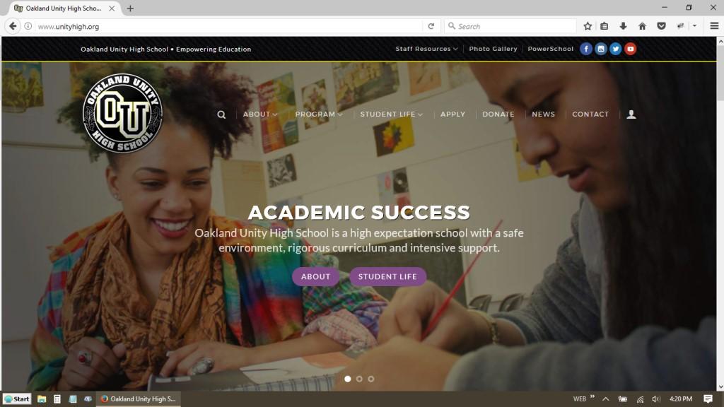
Oakland Unity High School Website Redesign

This is the second school of the Oakland Unity Charter Schools organization. They raise funds, generate support, do great work and send kids to college.

The Director needed to update both the High School as well as the Middle School. The state-of-the-art lightning fast WordPress theme transformed an outdated website into a great-looking informational domain that brings all of the school information and social networks under one roof.

352 existing Blog Posts were exported, imported and styled for a beautiful and usable display.

The logo was sharpened, cleaned up and enlarged to create a bold look and feel with school spirit. The site looks great on HD TVs as well as mobile devices. A modern embedded Google map on the Contact Page highlights the school’s location and the forms were replaced that encourages the user to send a quick message.

Everything is now right where it should be, looks great and the website can now proudly solicit monetary donations and support for the school with its new image.

Go to the website: Oakland Unity High School

Oakland Unity High School Website Redesign
Back To Top